When Autocorrect Fails
Who misspells the most on Twitter? Use API mining and visualization in R to find out.
During a time when autocorrect on our phones and computers carries a heavy load, sometimes poor grammar slips through the cracks. So, where in the U.S. has the worst spelling on Twitter? To explore this question, I looked at five major cities which represent different regions of the country. To have the “worst spelling” is a bit broad so I choose it to mean the percentage of time a city misspelled one of the top four most commonly misspelled words with its most common misspelling.
I will use data analytics processes in conjunction with the following tools: Rstudio, twittR, wordcloud, ggplot2.
A special note, by ‘data analytics processes’ I mean methods of how I extracted the data, choose what data to use and discard, and the best ways to visually display the data so it is easiest to interpret.
The first step is to set up the user API
consumer_key <- "XXXXXXXXXXXXXXXXX"
consumer_secret <- "XXXXXXXXXXXXXXXXXXXXXXXXXXXXXXXXXXXXX"
access_token <- "XXXXXXXXXXXXXXXXXXXXXXXXXXXXXXXXXXXXXXXXXXXXXX"
access_secret <- "XXXXXXXXXXXXXXXXXXXXXXXXXXXXXXXXXXXXXXXXXXXXX"
setup_twitter_oauth(consumer_key, consumer_secret, access_token, access_secret)
Next, I setup the correct and incorrect word spellings
correct <- c("their", "a lot", "received", "separate")
misspelled <- c("thier", "alot", "recieved", "seperate")
And the cities I want to study
cities <- data.frame(matrix(ncol = 2, nrow = 0))
colnames(cities) <- c("name", "geocode")
cities <- rbind(cities, data.frame(name="Boston", geocode="42.3601,-71.0589,30mi"))
cities <- rbind(cities, data.frame(name="Los Angeles", geocode="34.0522,-118.2437,30mi"))
cities <- rbind(cities, data.frame(name="Chicago", geocode="41.8781,-87.6298,30mi"))
cities <- rbind(cities, data.frame(name="Houston", geocode="29.7604,-95.3698,30mi"))
cities <- rbind(cities, data.frame(name="Atlanta", geocode="33.7490,-84.3880,30mi"))
Now let’s obtain a collection of tweets then calculate the percent of tweets misspelled per city and per word so we get a total of 20 outputs like “Boston misspells their with thier 2 percent of the time”
count <- 100
data_txt <- list()
results <- list()
apply(cities, 1, function(city) {
  for(wordIndex in 1:length(correct)) {
    searchTerm <- paste(paste(correct[wordIndex], "OR", misspelled[wordIndex], sep=' '), '-filter:retweets', sep=' ')
    tweets <- searchTwitter(searchTerm, n=count, geocode=as.character(city['geocode']), resultType="recent")
    sapply(tweets, function(x) {
      index <- length(data_txt) + 1
      data_txt[[index]] <<- x$text
    })
    incorrectPercentage <- 100 - length(Filter(function(x) grepl(correct[wordIndex], tolower(iconv(x$text, to="utf-8-mac")), fixed=TRUE), tweets))/count*100
    results[[length(results) + 1]] <<- c(city = city['name'], percent = incorrectPercentage)
    print(paste(city['name'], "misspells", correct[wordIndex], "with", misspelled[wordIndex], incorrectPercentage, "percent of the time"))
  }
})
data_txt <- unlist(data_txt)
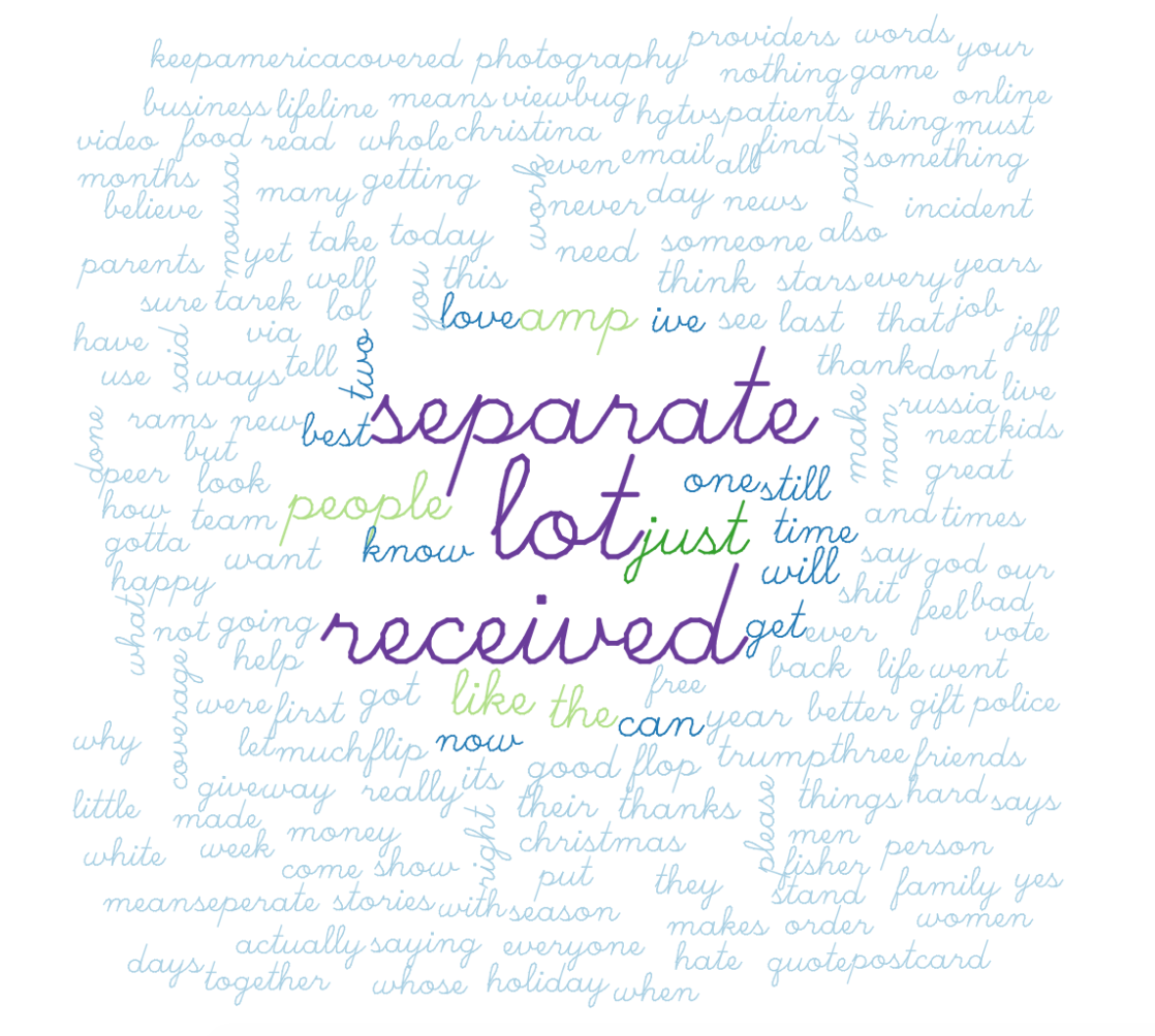
Now that we have some data to work with let’s display it with a word cloud. We don’t expect there to be a theme in all of the tweets we collected but it’s worth a look. Just clean up the tweets a bit so the material extrapolated for the word cloud looks uniform and is interesting. (removing numbers and whitespace, taking out capitals and punctuation, removing stopwords like ‘the’ ‘a’ ‘to’ etc.)
data_txt <- iconv(data_txt,to="utf-8-mac")
data_corpus <- Corpus(VectorSource(data_txt))
data_clean <- tm_map(data_corpus, removePunctuation, lazy=TRUE)
data_clean <- tm_map(data_clean, content_transformer(tolower), lazy=TRUE)
data_clean <- tm_map(data_clean, removeWords, stopwords("english"), lazy=TRUE)
data_clean <- tm_map(data_clean, removeNumbers, lazy=TRUE)
data_clean <- tm_map(data_clean, stripWhitespace, lazy=TRUE)
wordcloud(data_clean, scale = c(4,1), max.words = 200, random.order = F, colors=brewer.pal(10,"Paired"), vfont=c("script", "plain"))
Here is one of the word clouds produced by the code. Keep in mind the word cloud is randomly generated each time the code is run.
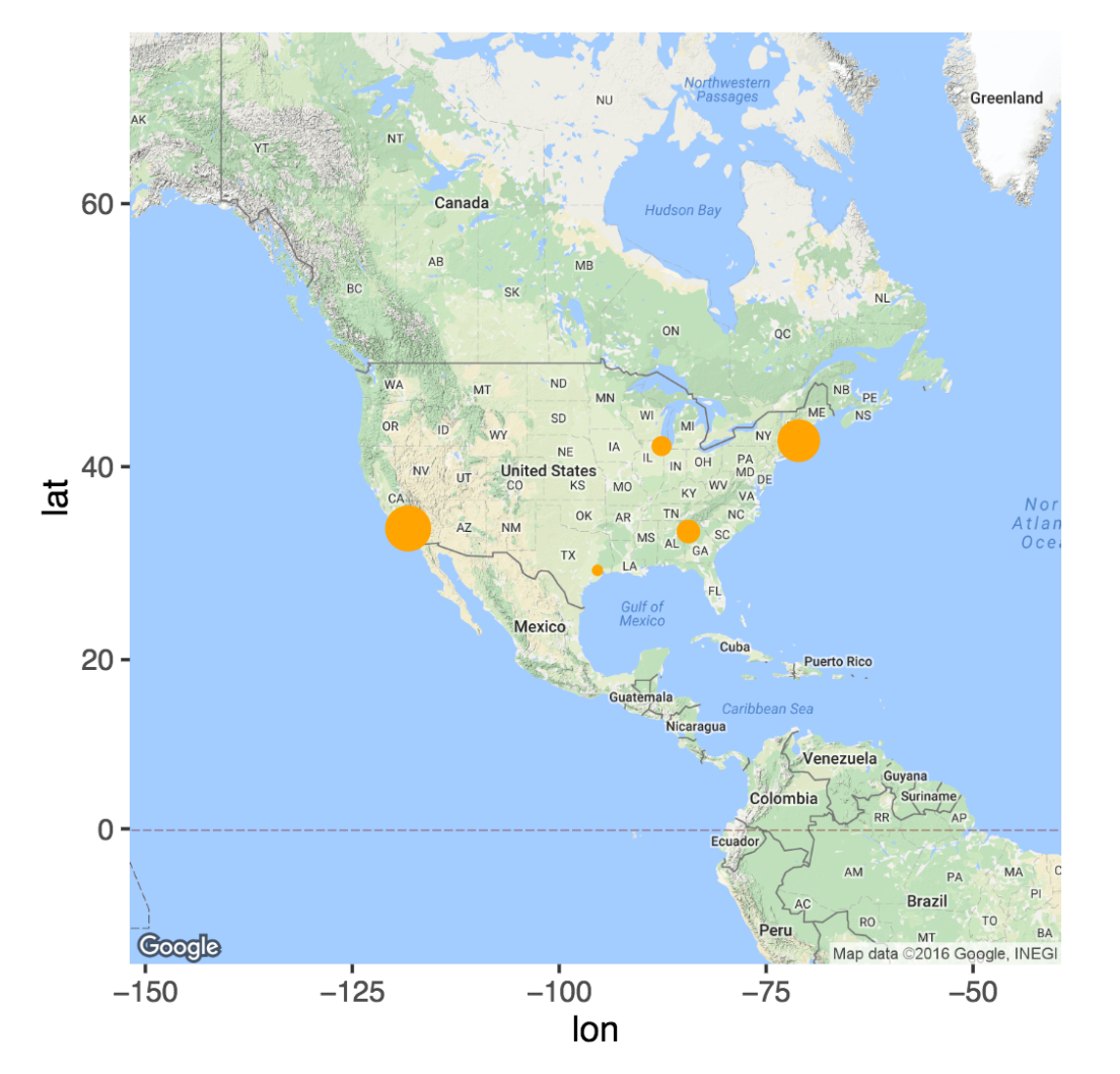
Lastly, let’s look at a more complex way to visually display our findings. I will make a map of the U.S. where each city is marked with a dot. Each city’s dot size corresponds to its calculated percentage of the Twitter population which misspelled common words.
boston <- 0
houston <- 0
los_angeles <- 0
chicago <- 0
atlanta <- 0
sapply(results, function(element) {
  if(as.character(element['city.name']) == "Boston") {
    boston <<- boston + as.numeric(element['percent'])
  }
  if(as.character(element['city.name']) == "Houston") {
    houston <<- houston + as.numeric(element['percent'])
  }
  if(as.character(element['city.name']) == "Los Angeles") {
    los_angeles <<- los_angeles + as.numeric(element['percent'])
  }
  if(as.character(element['city.name']) == "Chicago") {
    chicago <<- chicago + as.numeric(element['percent'])
  }
  if(as.character(element['city.name']) == "Atlanta") {
    atlanta <<- atlanta + as.numeric(element['percent'])
  }
})
results
percents <- c(boston, los_angeles, chicago, houston, atlanta)
max_percents <- max(percents)
percents <- sapply(percents, function(x) x/max_percents*6)
map <- cbind(geocode(as.character(cities$name)), cities)
ggmap(get_map(location = 'usa', zoom = 3)) + geom_point(data=map, aes(x=lon, y=lat, size=percents),show.legend=F, color="orange")
Here is our result
For more details check it out on github
