Interactive Visualization
Create interactive visual displays with Shiny in R Studio.
I want to make interactive distributions of a few random variables. I want to see how changing sample size and other parameters changes the distribution.
We will be using a shinyApp with multiple tabs for each distribution. This requires using the ‘shiny’ package and since we are using random sampling, I’ve set the seed to 5.
library(shiny)
set.seed(5)
Note: the full code is at the bottom if at any point you would like to interact with the application on your own device or refer to it in full.
Let’s get started. The format of a shinyApp consists of two parts: the ui and the server. Each is commonly used as the variable to represent functions. The ui consists of the front end code because it is where page layout and parameters are defined. The server is the back end. This code is run each time parameters are updated. The line of code at the bottom is a function that creates the shinyApp and pairs the ui and server.
ui <- fluidPage(...
)
server <- function(input, output) {...
}
shinyApp(ui = ui, server = server)
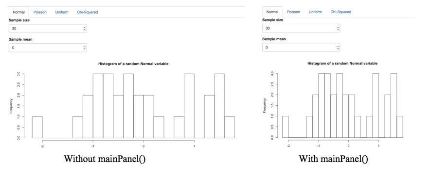
We want the application to have a tabbed format for each distribution, this is represented in the ui function. Each distribution is enveloped in a tabPanel. All tab panels are enclosed around a tabsetPanel. Additionally, we need to nest all of this in a mainPanel. The application will still run without the mainPanel; however, it makes the format more visually appealing.
Normal Distribution
Let’s start by creating a normal distribution. First we’ll take a look at the ui component. As we saw each distribution will be enclosed in its own tabPanel. The first input in the tabPanel is the name of the tab. Next we use the numericInput function to represent each parameter for a normal distribution. The inputId represents the input and will be referenced in the server code. Sample size is the name of the variable as it will appear on the application and value is the preset value for the sample size variable. Similarly, we have created a sample mean variable for the normal distribution. Finally, plotOutput is used to indicate the need for a plot and is referenced in the server code.
      tabPanel("Normal", numericInput(inputId = "n", "Sample size", value=30),
               numericInput(inputId = "mean", "Sample mean", value=0),
               plotOutput("normal"))
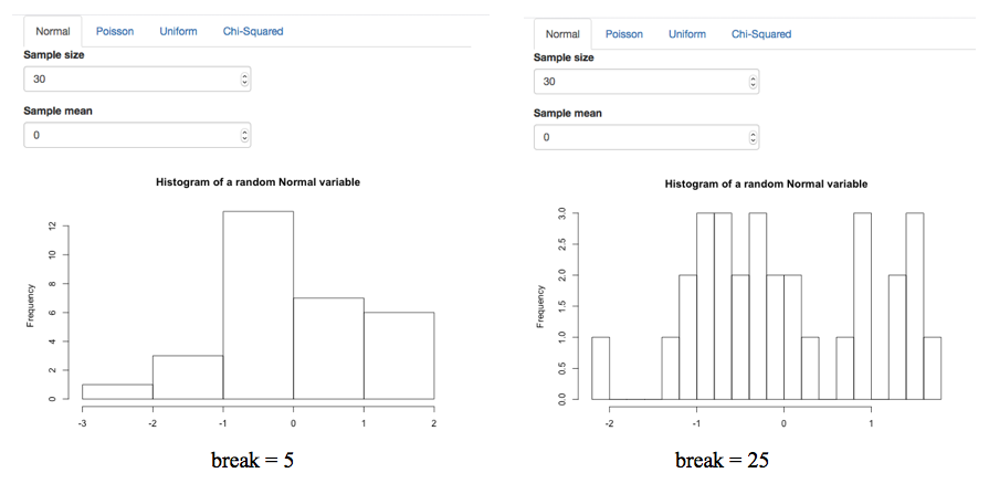
In the sever portion, the code accompanying each distribution is defined by an output association then wrapped in a render plot function. The output association is referencing the plotOutplut name. We are rendering a histogram using random sampling from a normal distribution and using the two parameters we defined in the ui code. The break number is seen as the thickness of the bars on the histogram. A large break number means a less detailed histogram so for our purposes we’d like a large break number. Finally, we define the title and labels of the graph.
  output$normal <- renderPlot({
    hist(rnorm(input$n,input$mean),breaks=25,main="Histogram of a random Normal variable", xlab="")
  })
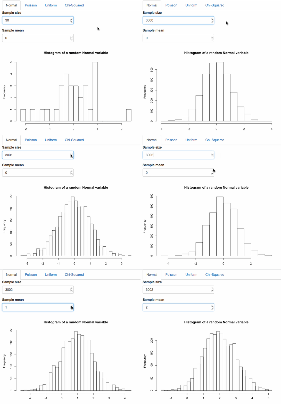
Here’s a look at the interactive normal distribution in use. As sample size increases the histogram looks more like the probability density function.
Poisson Distribution
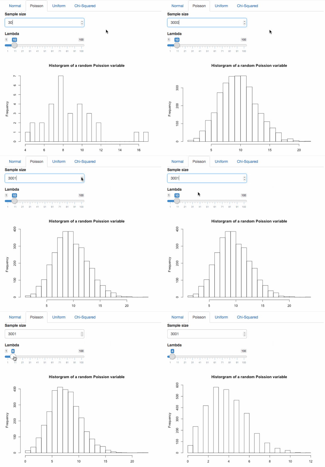
The Poisson distribution has parameters: sample size and lambda. For the lambda parameter I’ve set the default value to 10, the minimum value to 1 and the maximum value to 100. I have also indicated that the slider should increase/ decrease by increments of 1. Take notice, sample size is a variable in every distribution but the inputId names need to be unique.
ui:
      tabPanel("Poisson", numericInput(inputId = "xtop", "Sample size", value=30),
               sliderInput(inputId = 'lambda', label="Lambda", min=1, max=100, value=10, step=1),
               plotOutput("poisson")),
server:
  output$poisson <- renderPlot({
    hist(rpois(input$xtop,input$lambda), breaks=25, main="Historgram of a random Poission variable", xlab = "")
  })
With large sample size, the poisson follows its probability mass function at various lambdas.
Discrete Uniform Distribution
The discrete uniform distribution has parameter: sample size.
ui:
      tabPanel("Uniform", numericInput(inputId = "n2", "Sample size", value=30),
               plotOutput("discrete")),
server:
  output$discrete <- renderPlot({
    hist(runif(input$n2,min=0,max=1),breaks=25,main="Histogram of a random discrete Uniform variable", xlab="")
  })
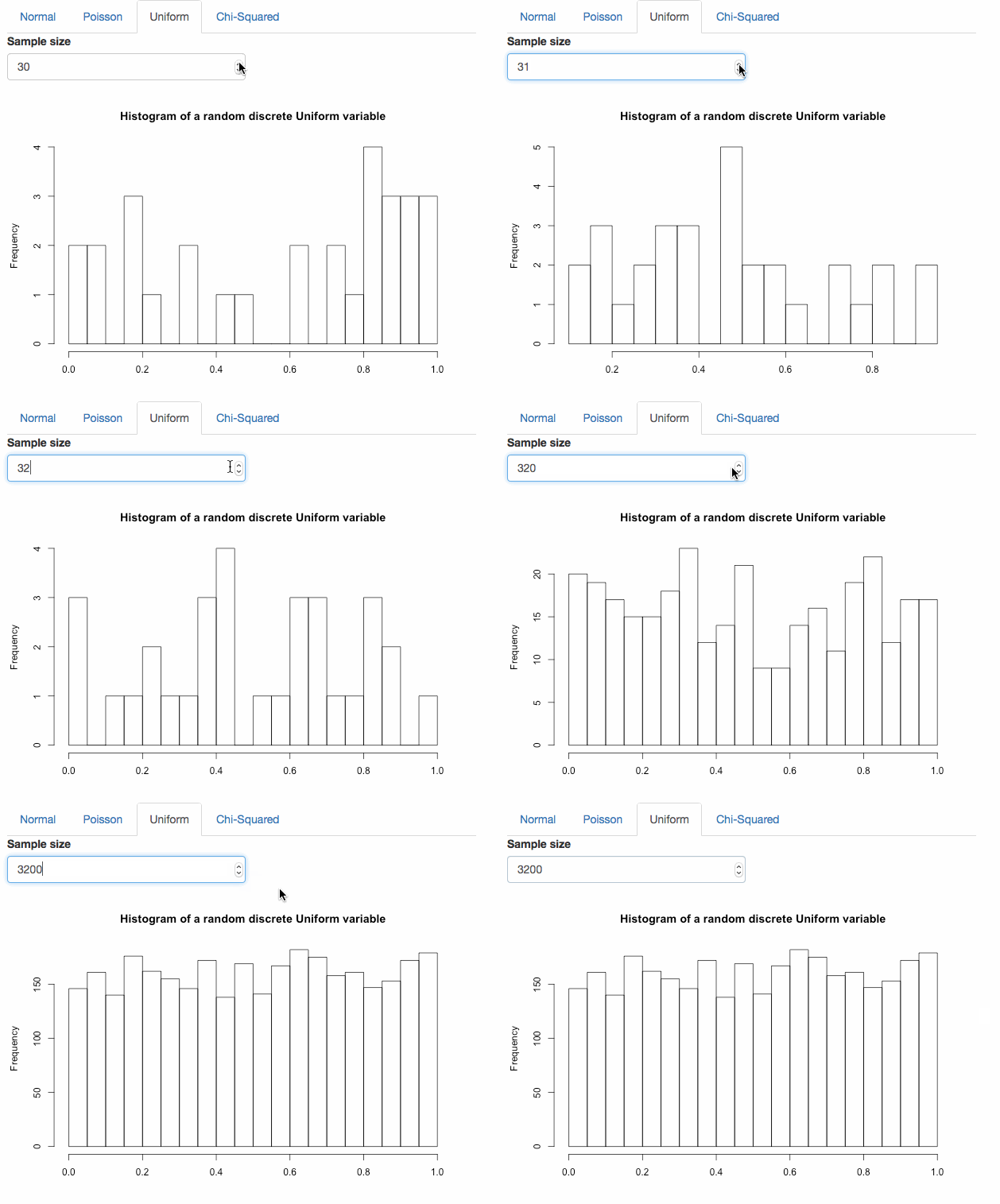
The larger the sample size, the more the histogram mirrors its ideal probability mass function.
Chi-Squared Distribution
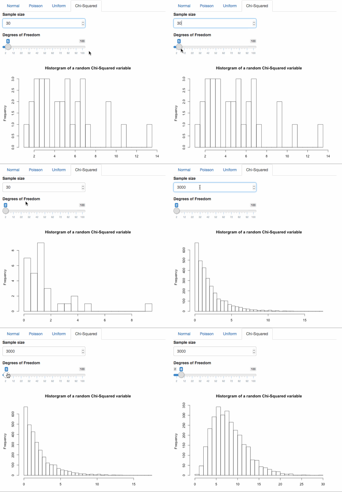
The chi-squared distribution has parameters: sample size and degrees of freedom. The degrees of freedom default value is 5 with a minimum of 2 and a maximum of 100. The degrees of freedom scale should increase/decrease by increments of 1.
ui:
      tabPanel("Chi-Squared", numericInput(inputId = "n3", "Sample size", value=30),
               sliderInput(inputId = 'df', label="Degrees of Freedom", min=2, max=100, value=5, step=1),
               plotOutput("chiSquared"))
server:
  output$chiSquared <- renderPlot({
    hist(rchisq(input$n3,input$df), breaks=25, main="Historgram of a random Chi-Squared variable", xlab = "")
  })
With large sample size the histogram looks like its probability density function. It may not at first but notice how frequency changes. The maximum frequency for df=1 is much greater than when degrees of freedom decreases.