Log Transformation
Simple linear regression log transformation in R.
In modern statistical practice, methods to analyze linear data are much more understood than nonlinear data. So, ideally the data you’re working with has a linear trend. When it does not, what can be done? Transformations. Some common types of transformations include: log, square root, cube root, and reciprocal. While there is broad criteria to determine which method of transformation should be used, it takes years of experience to master the art.
Here, we will use R to look at a simple linear regression, identify it as nonlinear, apply a log transformation, and confirm our changes have improved the data.
Let’s use the UN11 data from the alr4 package. Remember you only need to install the package the first time you use it. The last line of code will provide a detailed description of the interpretation of the data set.
install.packages("alr4")
library(alr4)
?UN11
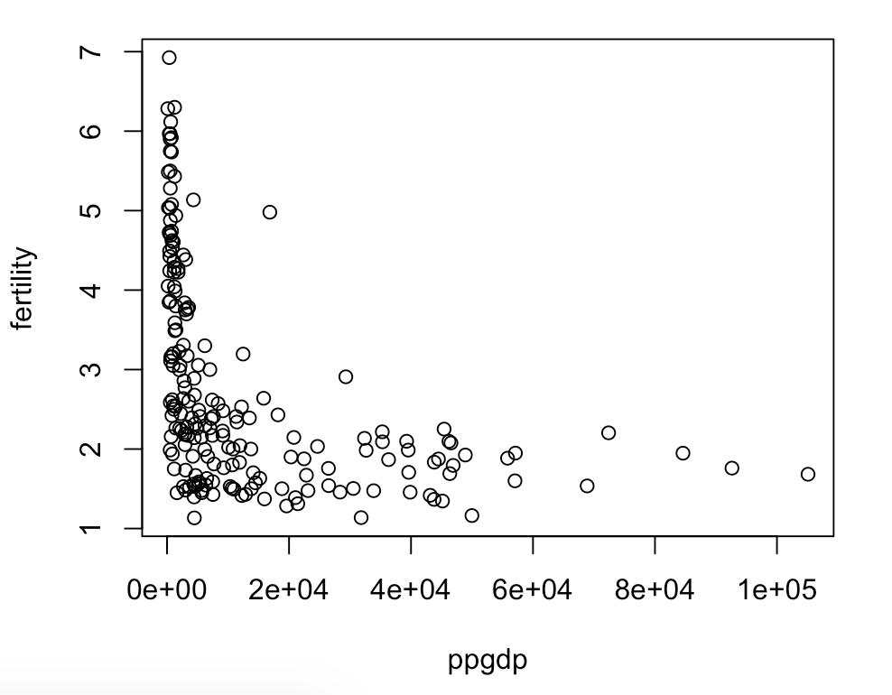
The simple linear model we would like to study is how per capita gpd (ppgdp) predicts number of children per women (fertility). For data that is linear, the plot of these variables should show a linear trend.
plot(UN11$ppgdp, UN11$fertility)Here we see the data exponentially decreasing. This is a problem because the exponential function is most certainly not linear.
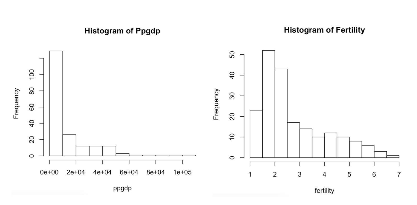
Another way to check for linearity of variables is to look at their histograms. Linear data will conform to a normal bell curve while nonlinear data will have skewed histograms.
hist(UN11$ppgdp, main ="Histogram of Ppgdp", xlab= 'ppgdp')
hist(UN11$fertility,main ="Histogram of Fertility",xlab = "fertility")
As expected, our variables confirm to be nonlinear
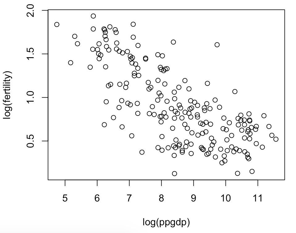
At this point a seasoned statistician would suggest this data needs to be transformed with the log function. So, lets plot the regression where each variable has been transformed.
plot(log(fertility) ~ log(ppgdp), UN11,ylab="log(fertility)", xlab="log(ppgdp)")Where we before saw an exponential trend we now see a negative linear trend. This plot looks good because log transformation has successfully made the data behave linearly.
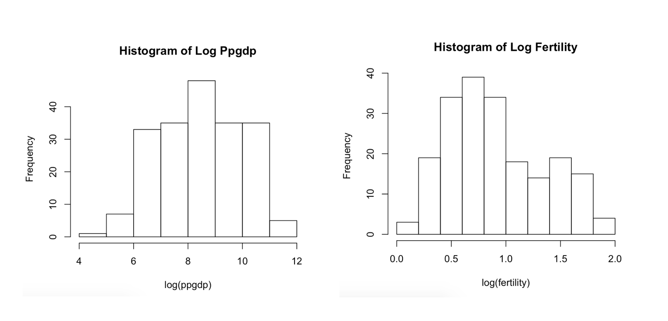
Finally, let’s take an individual look at the histograms of our transformed variables.
hist(log(UN11$ppgdp),main ="Histogram of Log Ppgdp", xlab = 'log(ppgdp)')
hist(log(UN11$fertility), main = "Histogram of Log Fertility", xlab = "log(fertility)")
We can see a great improvement to the skewedness of the histograms. While they don’t look like completely standard bell curves, the transformation has greatly changed the behavior of the data to act more linear.