Cleaning and Visualizing Data
Learn how to clean data effectively and preseent information through visualizations in R.
There is no lack of data on the internet but to make something useful of it is 90% of the battle. Here, I’m going to step through common practice of cleaning a large data set in R. The process I will use to clean the data is based off conventions introduced in an article by R expert Hadley Wickham. Ultimately, we’d like to have a data set we can easily work with to pull interesting results.
I chose a large messy data set to explore job patterns for minorities and women in private industries during 2009. Government data sets are good to use when practicing data cleaning skills because the files are typically large and messy. To start the cleaning process, I read the data into R
data <- read.table("YEAR09_CBSA_NAC3.txt", header= TRUE, sep=";")Step 1: I need to rename columns to accurately reflect their data. I did the majority of this manually. (I know this is not the most efficient way but it’s one of my first R projects)
names(data)[1] <- "Area"
names(data)[2] <- "Industry"
names(data)[3] <- "to be removed"
names(data)[4] <- "to be removed"
Now, because this data set is so big let’s narrow the area of focus to the Boston category.
data <- subset(data, Area=='Boston-Cambridge-Quincy, MA-NH')Consequentially, we will want to make changes such as removing the city, state column and removing columns where the notation was not in the legend.
data <- data[-c(1, 3, 4, 588:598, 599, 600)]Step 2: At this point our observations are represented as columns; however, convention is for each observation to be a row. The process of turning columns into rows is called ‘melting’. So, now I will melt the data using the reshape package written by Hadley Wickham.
library(reshape)
melted <- melt(data, id=c("Industry"))
Step 3: Another characteristic of tidy data is that each variable represents a column. Here we have information of several variables contained in one column. So, the column should be separated into several. In this example the variables: race, gender, type of data, and position are all in one column. I will use another Hadley Whickham package tidyr to create four individual columns from the one.
library(tidyr)
split <- separate(melted, variable, c("Race", "Gender", "Type", "Position"), sep = ":")
Step 4: I delete rows with NA entries. As convention it is okay to delete them because sometimes information is just missing.
split <- subset(split, !is.na(value))Step 5: The final major characteristic for tidy data is for each observational unit to be a table. In this case we have a column for type of data in which there are two types: number total and percent. So, let’s make two tables instead of having one.
totals <- subset(split, Type=="Total")
percentage <- subset(split, Type=="PoW")
Now, we no longer need the type of data column because it is reflected in the table title so let’s get rid of that.
totals <- totals[-c(4)]
percentage <- percentage[-c(4)]
Congratulations, our data set is clean! It’s time to explore our data.
First, Let’s look at a breakdown of number of workers by gender and position. These results visualized can provide intuition about trends and important questions such as: Are there significantly less female senior managers than male?
Here we use ggplot to graph a subset version of our data. We want a subset version which excludes information that would distort our graph. What questions would you ask based on the graph we’ve extrapolated?
totalOverallByGender <- subset(totals, Gender != "Overall" & Race != "Minority")
ggplot(data = totalOverallByGender, aes(x=Position,y=Total,fill=factor(Gender))) +
  geom_bar(stat="identity",position='dodge') +
  theme(axis.text.x=element_text(angle=70,hjust=1,vjust=1)) +
  labs(title='Total Workforce in Positions by Gender', fill='Gender', y='# of Workers')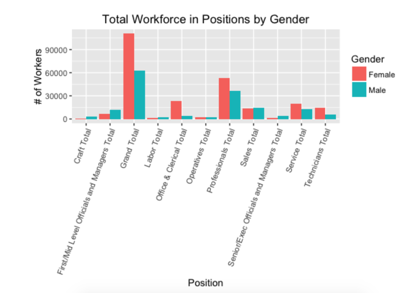
Second, let’s use our percentage table to look at the percentage of workers broken down by race for each position in the Food Service and Drinking Places industry. Again we need to subset the data to suit our interests and use ggplot to customize the visuals of our chart.
percentageFood <- subset(percentage, Gender == "Overall" & Industry == "Food Services and Drinking Places" & Race != "Minority")
ggplot(data = percentageFood, aes(x=Position,y=Total,fill=factor(Race))) +
  geom_bar(stat="identity") +
  theme(axis.text.x=element_text(angle=70,hjust=1,vjust=1)) +
  labs(title='Food Services and Drinking Places Industry', y='% of Workforce', fill='Race')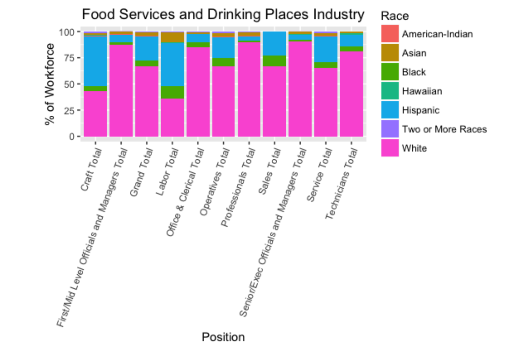
There are countless questions that can be asked using the information stored in large data sets. Using the conventions of tidy data makes a world of difference in being able to answer those questions. Ultimately, we have data that is easy to work with as we take the next steps to answer these questions using statistical methods.
For more details check it out on github
